Granny Square Color Combinations: 12 Palettes and How to Choose
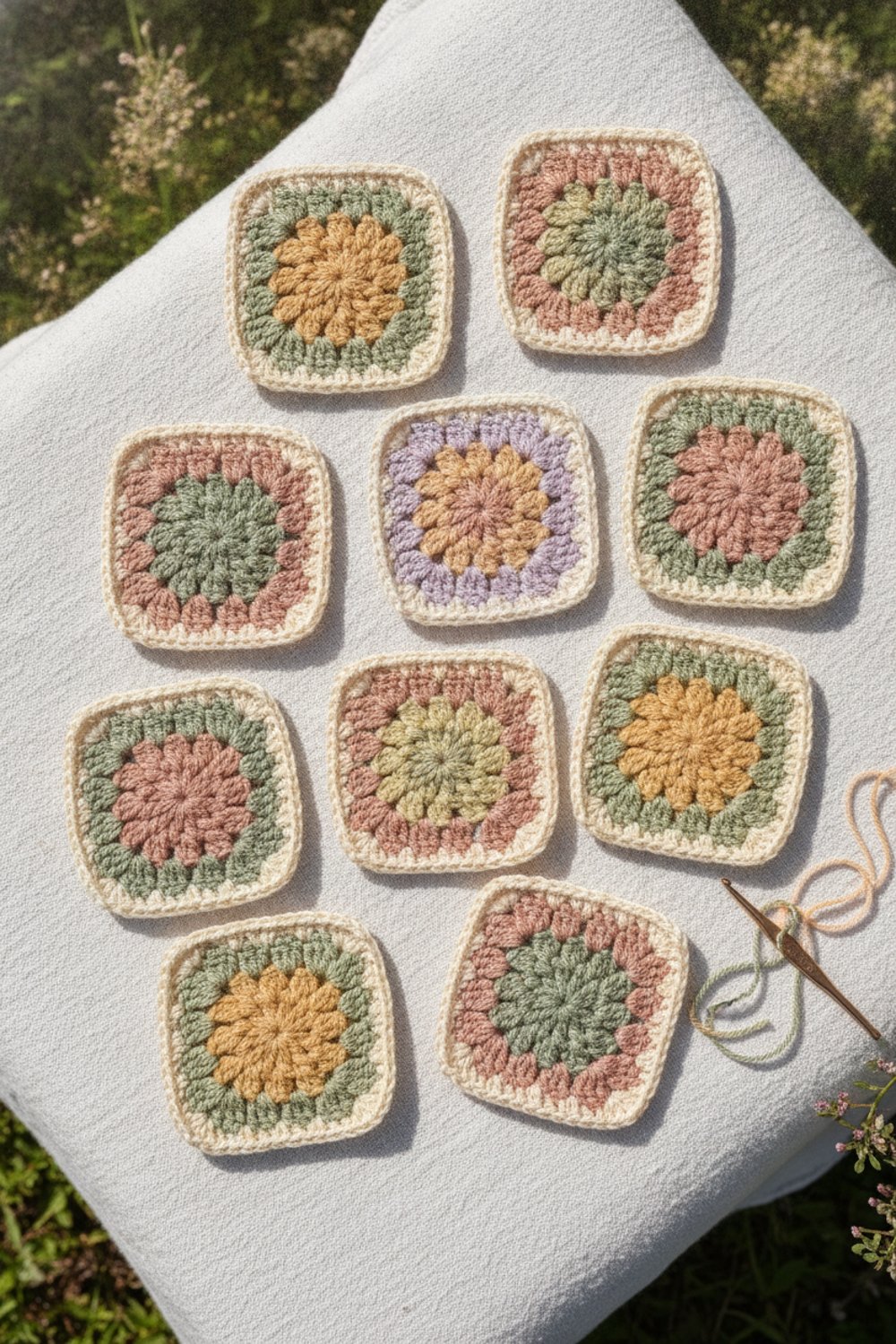
Picking colors is the most fun part of a granny square project, and also the part that makes people freeze in the yarn aisle. Too many colors can look messy. Too few can look flat. The trick is to follow a few simple rules and test before you commit.
In this guide you will find easy color rules, 12 granny square color combinations you can copy, and a step-by-step way to test your palette before you make 100 squares. These ideas work for blankets, bags, pillows and cardigans.
What You’ll Need
- A few balls of yarn in your possible colors (same weight and same yarn line if you can)
- A crochet hook in the right size for your yarn
- A color wheel card
- A yarn needle
- Your phone camera (for the black-and-white test below)
Color Basics in Plain English
You do not need an art degree. These four ideas cover most of what you need:
| Scheme | What it is | Feels like |
|---|---|---|
| Analogous | Colors next to each other on the color wheel (like yellow, orange, red) | Calm, warm, cozy |
| Complementary | Colors across from each other (like blue and orange) | Bold, high contrast |
| Monochromatic | Light and dark shades of one color | Soft, modern, simple |
| Scrappy | Lots of colors with no strict plan | Cheerful, vintage, playful |
Two more helpful rules:
- Limit your palette. For a planned blanket, Underground Crafter suggests 3 to 4 colors for the squares plus 1 extra color for borders and joins. For a scrappy blanket, the same article shares a quilters’ rule of thumb: use 7 or more colors, and exact matching matters much less.
- Mix light, medium and dark. Contrast is what makes the rounds of a granny square stand out. If every color is the same lightness, the square looks blurry.
12 Granny Square Color Combinations to Try
These are starting points. Use the closest shades your favorite yarn line offers.
| # | Palette | Colors (center to edge) | Joining color |
|---|---|---|---|
| 1 | Classic vintage | Red, yellow, blue, green | Black or cream |
| 2 | Cottage garden | Rose pink, butter yellow, sage green, lavender | Cream |
| 3 | Autumn harvest | Mustard, rust, olive, brown | Cream |
| 4 | Ocean | Navy, teal, aqua, white | White |
| 5 | Earthy neutral | Oatmeal, camel, chocolate, taupe | Cream |
| 6 | Sunset | Coral, peach, gold, deep pink | Cream |
| 7 | Christmas | Red, green, white, gold | White |
| 8 | Baby soft | Pale mint, pale yellow, baby pink, light gray | White |
| 9 | Berry | Plum, raspberry, blush, wine | Gray |
| 10 | Seventies | Orange, brown, mustard, avocado | Cream |
| 11 | Modern gray | Charcoal, light gray, mustard, white | Charcoal |
| 12 | Rainbow scrap | Any 7+ bright colors | White or black |
A few notes:
- Black joining makes bright colors glow, like stained glass. It is the traditional look for vintage-style granny blankets.
- Cream or white joining softens and lightens everything. It is the safest choice when you are not sure.
- Gray or charcoal joining looks modern and hides everyday dirt better than white.
How to Test Your Palette Step by Step
Step 1: Line them up. Put your yarn balls next to each other in natural daylight. Remove any color that “shouts” louder than the rest, unless you want it as an accent.
Step 2: Take a black-and-white photo. Use your phone’s mono filter. If two colors look like the same gray, they will blend together in the square. Swap one of them for a lighter or darker shade.
Step 3: Make 2 or 3 test squares. Try the same colors in a different order in each square. The color in the center and the color on the outside change the look a lot.
Step 4: Add the joining color. Hold your test squares on top of the joining color yarn, or crochet a quick outline round. This is often the moment a palette suddenly “works.”
Step 5: Step back. Put the squares on the floor and look from across the room. That is how people will see your blanket.
Ways to Arrange Colors in a Blanket
- Same order in every square. Very tidy and calm. Good for small palettes.
- Random order. Each square uses the same colors in a different order. Darleen Hopkins at I Like Crochet notes in her granny square tips that squares in a set do not need to be identical to look cohesive.
- Rows or diagonals. Make each row or diagonal line of squares a different main color for a striped or ombre effect.
- One color per square. Solid single-color squares joined in a checkerboard look bold and modern.
A real example: Sarah Maker’s free Granny Square Blanket uses five colors of Lion Brand Heartland. Every square uses all five colors in a different order, and one color is used much more than the others (the pattern calls for 3 skeins of it and 1 skein of each of the rest). It is a good model for a planned, balanced palette.
The 60-30-10 Trick
If you love lots of colors but want the blanket to feel calm, try splitting your yarn like this:
- 60 percent main color (often your joining and border color)
- 30 percent second color
- 10 percent accent color
This classic decorating rule keeps one color in charge, so the others can play without looking messy.
Common Mistakes (and How to Fix Them)
- All colors are the same lightness. The rounds blur together. Swap in one light and one dark shade.
- One color takes over. A very bright or very dark shade can dominate. Use it only in the center round or as a small accent.
- Mixing yarn brands. Different brands can look different in the same color name and may make different-sized squares. Stay in one yarn line if possible.
- Choosing colors under indoor light. Store and home lighting changes how colors look. Check in daylight.
- Running out of one color. Count how much of each color your test square uses, then multiply. Buy all yarn up front for matching dye lots.
Tips
- Save a photo of your favorite granny blankets and use them as color inspiration.
- Start a new color in a different corner on each round so joins do not stack up.
- Variegated yarns can work as one round in a square, but pair them with solids so the square does not look too busy.
- When in doubt, add a neutral. Cream, oatmeal or light gray can calm almost any palette.
- Keep a small “color library” of leftover test squares. They make great coasters later.
FAQ
How many colors should a granny square blanket have?
For a planned look, 3 to 4 colors plus one joining or border color is a common rule. For a scrappy look, 7 or more colors usually works better, because no single color stands out as a mistake. Both approaches can be beautiful.
What color should I use to join granny squares?
Cream and white are the safest choices because they soften and connect almost any palette. Black gives a bold, classic vintage look that makes bright colors pop. Gray is a modern middle ground. Test your joining color with a few squares before you commit.
Should the center of a granny square be light or dark?
Either works. A light center draws the eye in, like a flower. A dark center feels grounded and bold. Try two test squares with the same colors in reverse order and see which one you like better.
Make a few test squares this week, and you will find a palette you love working with for the whole blanket.